Serrurerie Moderne logo redesign
The graphic proposals of the Serrurerie Moderne logo
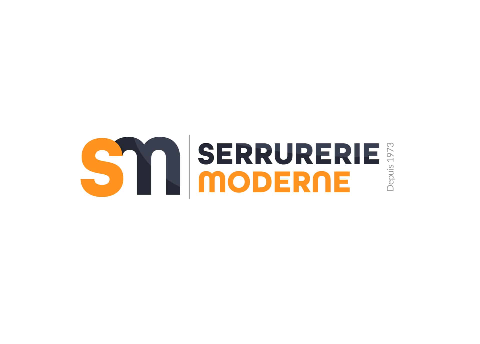
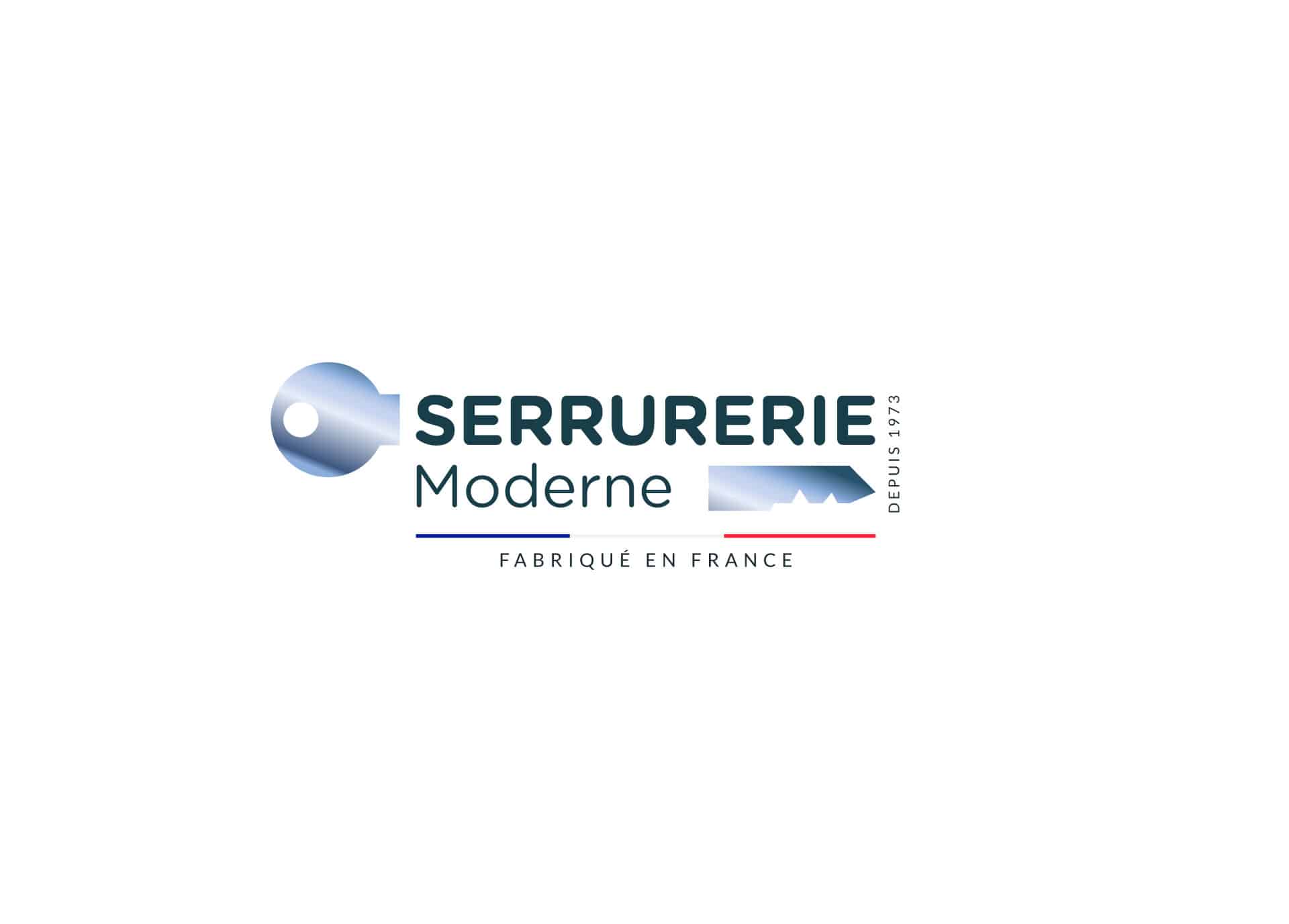
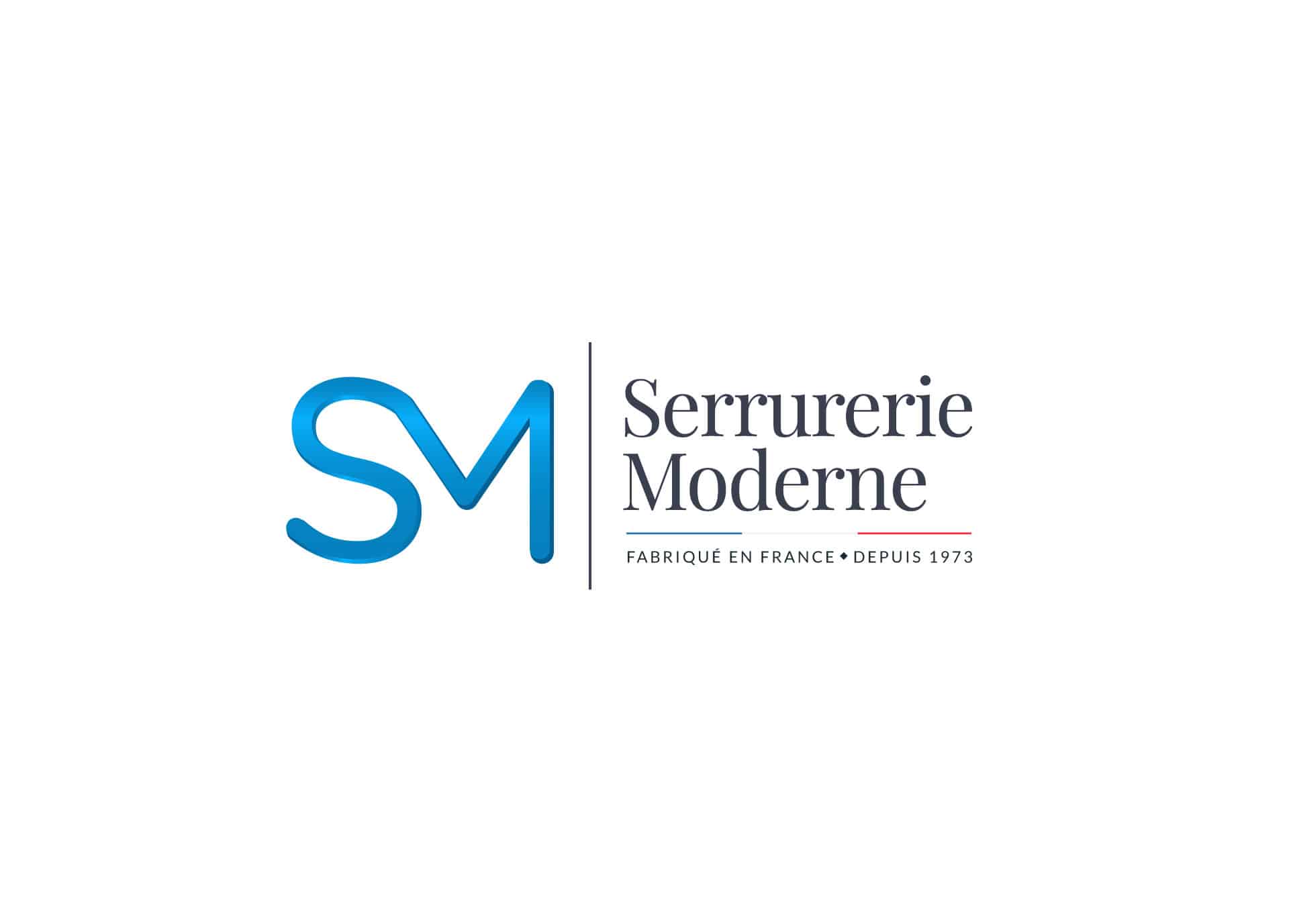
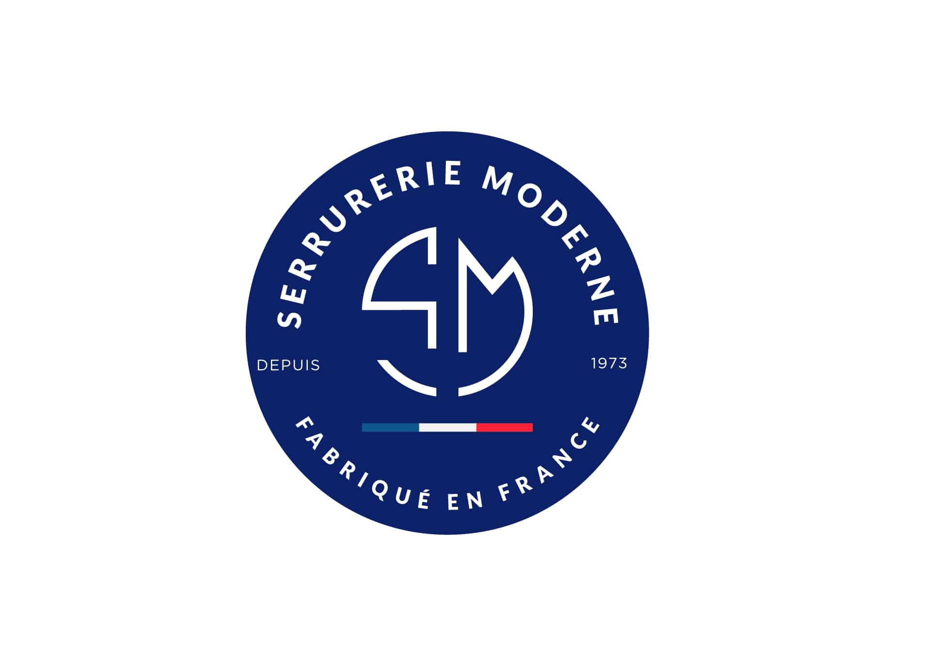
We submitted 4 graphic proposals to our client, 2 of which were with variations.
Our graphic designer, Judith, highlighted the “French manufacture” and the know-how “since 1973” in some of the proposals. In terms of colours, she worked with different shades of blue and metallic effects with, in addition, a proposal in orange. For the symbol, Judith used the combination of the initials S and M to create a monogram and she also offers a version with the pictogram of a key.
Typography: Judith mainly worked with stick fonts (sans serif) for its clarity and modernity; However, there is a proposal with a font with serif for its traditional side.
First proposal and its declination
Second proposal and its declination
3rd graphic proposal
4th graphic proposal
Our client selected the first proposal on a blue background with a request: to thicken the band representing the colors of the French flag.
Here is the final version of the logo; Seduced?
